Study Room Reservation Portal
Study Room Reservation Portal
Redesigned the study room portal website that helps students reserve a room.
Redesigned the study room portal website that helps students reserve a room.


My Contribution
User Research
Affinity Diagram
Persona Wireframing
Usability Testing
Final Design
User Research
Affinity Diagram
Persona Wireframing
Usability Testing
Final Design
User Research
Affinity Diagram
Persona Wireframing
Usability Testing
Final Design
Tools
Figma
Microsoft Teams
Miro
Balsamiq
Figma
Microsoft Teams
Miro
Balsamiq
Timeline
8 Months
Summary
The Problem
Students struggle to navigate the current reservation system, which makes it difficult to reserve rooms, edit reservations, and quickly book rooms to share with others.
Students struggle to navigate the current reservation system, which makes it difficult to reserve rooms, edit reservations, and quickly book rooms to share with others.
Students struggle to navigate the current reservation system, which makes it difficult to reserve rooms, edit reservations, and quickly book rooms to share with others.


Solution
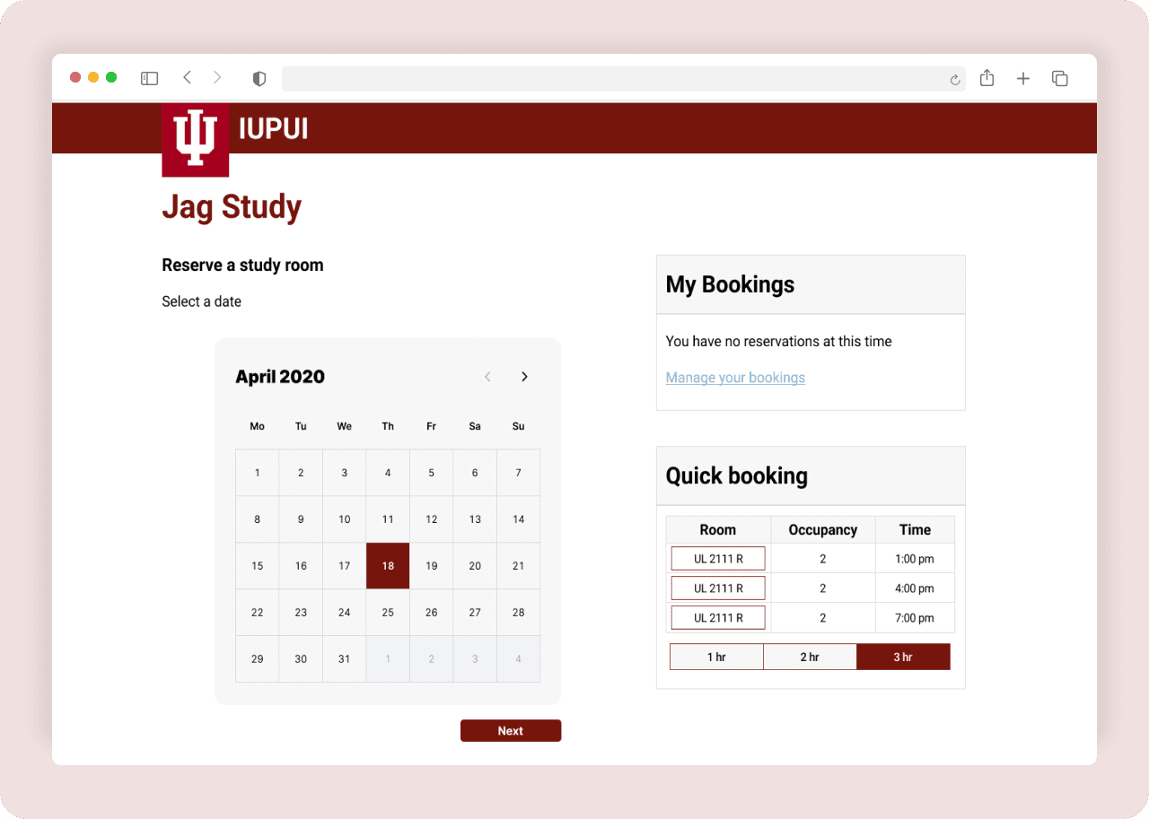
An efficient new reservation website includes a step-by-step process, editing, and quick booking capabilities.


My Role and Team
Desktop Viewing
Collaborated with the User Experience Librarian from IUPUI Library
Check it out on the desktop version
I was the lead UX designer of three designers. I led the redesign of the student study room portal and worked with the IUPUI User Experience Librarian at the IUPUI Library on project and status updates.
Hi there. If you want to view more information about this case study. Please View on a Desktop 🖥️ 🙂
User Research
Survey
Reaching out to the larger student audience
Reaching out to the larger student audience
We contacted 50 students to gain insight into their experience with the current reservation systems and recruit participants for our later usability testing.
We found out that students didn’t use the website or didn’t know there was a study room website. The students who used it only used it for group projects.


Usability Testing
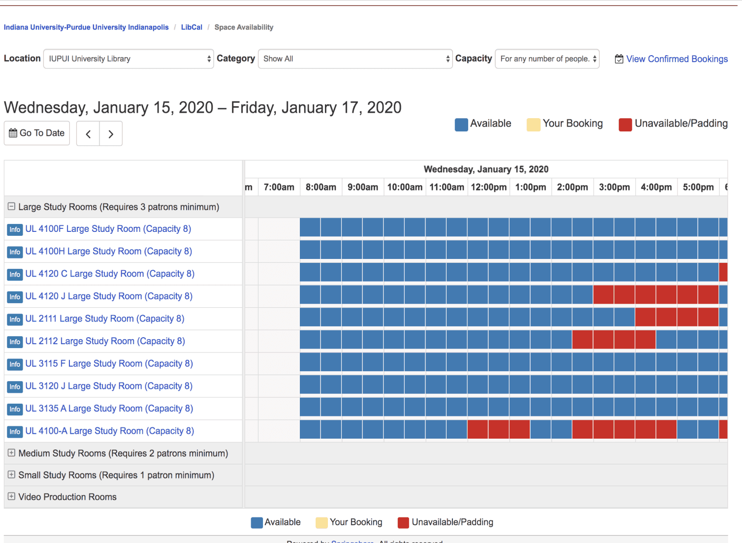
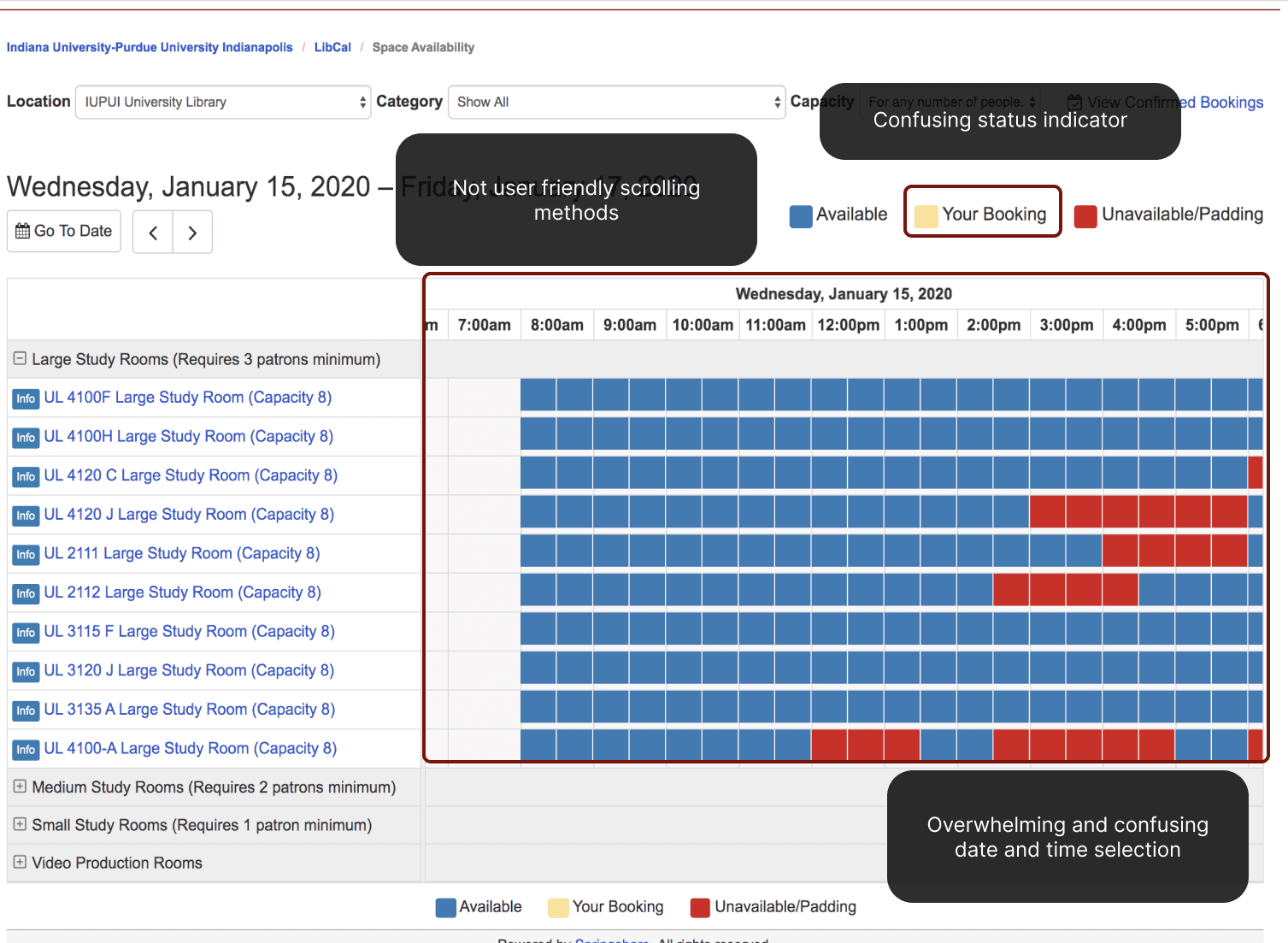
The overarching problem students faced in the reservation system was its overwhelming and confusing process.
We did 6 moderated Usability tests to observe, interview, and analyze how students interact with the study room website in real-time. It was challenging to record how the testing was done, but we did a pair of two people: one will moderate the test, and a second person will record the test findings.

Student Interviews
Students are looking for a less overwhelming and confusing process that doesn’t involve them being overloaded with information from the start.
We interviewed six students and divided the users into those who have used the study room website before and those who have not used it.
Using an affinity diagram, students feel the current reservation website was too hard to learn, confusing to use, and overwhelming to follow.


Here are the following major insights:
They didn't like scrolling gymnastics
They didn't like scrolling gymnastics
Users expressed their dislike for the scrolling methods used to pick a time and date. They found that very unintuitive to scroll both horizontally and vertically.
6 out of 6 interviewees wanted a more reliable, quicker way to reserve a room.
They wanted to be able to edit their reservation
They wanted to be able to edit their reservation
User expressed that they couldn't edit the reservation leading them to make another reservation.
5 out of 6 interviewees wanted to be able to edit their reserve a room date and time.
They found it time consuming
Users mentioned having difficulties finding rooms in library after making reservation.
6 out of 6 interviewees wanted less time-consuming reservation.
Define
How Might We framework
How might we reduce the number of steps required to reserve a study room?
How might we reduce the number of steps required to reserve a study room?
The library room reservation system required students to recall too much information from one part of the interface to another while reserving a study room. This is a problem because it made the room reservation process time-consuming, confusing, and error prone.
Based on the insights we received from our research, we formulated design questions to lead our brainstorming session. We wanted to know —
Simplification
Simplification
How might we simplify time and date selection for students?
Time - Saving
Time - Saving
How might we reduce the number of steps required to reserve a study room?
User Persona
Creating a persona to center our insights on students' pain points on the reservation system
Creating a persona to center our insights on students' pain points on the reservation system
After drafting our “How Might We” statement, we developed this persona to validate that our proposed solutions directly address the user’s core challenges. Further refining these insights keeps the user at the center of our design decisions.


User Journey map
The current journey is frustrating because it has unclear navigation, leading to missed reservations and confusion
After establishing our persona to capture user motivations and frustrations, we created this User Journey Map to pinpoint specific steps where students experience friction. Mapping the journey helps us see the bigger picture and ensures our design solutions address the root causes of frustration.


Based on the persona and journey map, I was able to identify the following major pain points:
Lack of Editing Capabilities
forces them to create new reservations when schedules change.
Multi-directional Scrolling
remains a major frustration, even for experienced users.
Lack of clear directions
forces even returned students to be confused.
Ideate
Brainstorming exercise
Following the consolidation of these research findings, we initiated a brainstorming phase to ideate potential features that could effectively tackle these concerns.


The basis for prioritizing each feature was determined by its potential to enhance the experience for students. So, we decided the new redesign should have these 3 main features:
Step-by-step booking process
Step-by-step booking process
Students will be given a step-by-step process not to make them feel overwhelmed or confused about the process.
Recall or error-prone system
Recall or error-prone system
To quickly edit their booking, students will have an area where they can edit their reservation if they need to correct a mistake.
Sharing capabilities
Sharing capabilities
Most students use the reservation website for group meetings, so sharing their booked rooms with colleagues will make the process easier.
Low-fi Wireframes
Conceptualizing the enhancing of the study room portal User Experience
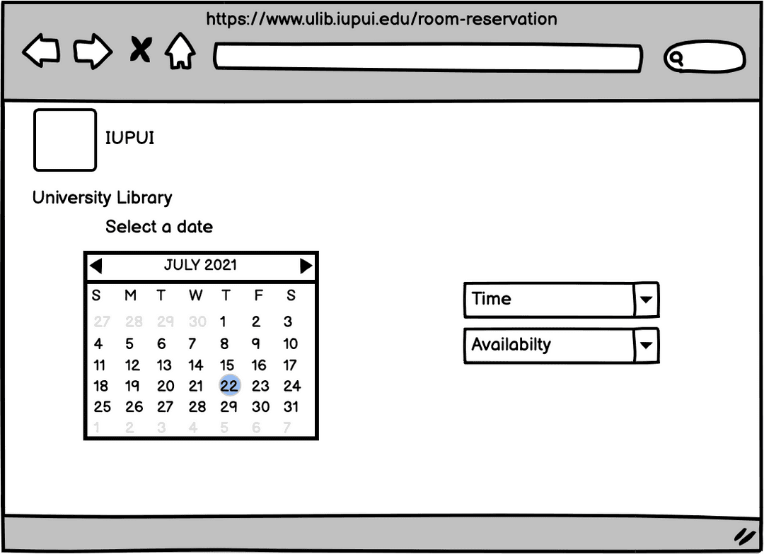
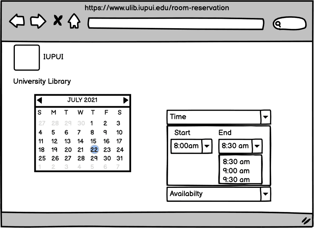
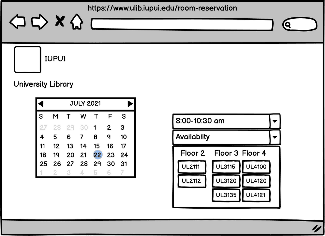
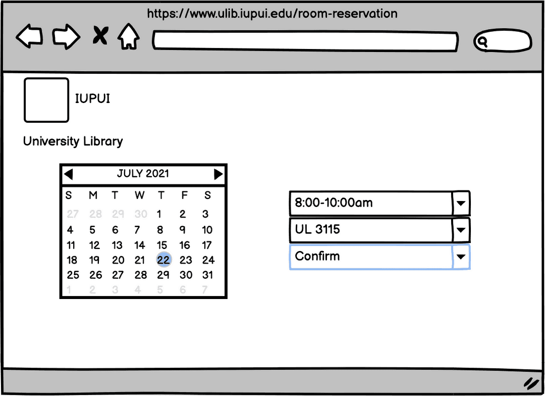
After deciding on our main focus for this design, we visualized low-fi wireframes using Balsamiq to map out various interface layouts and interactions that addressed students' needs and pain points.
Hi-Fidelity Prototype
First- iteration of the high-fidelty prototype
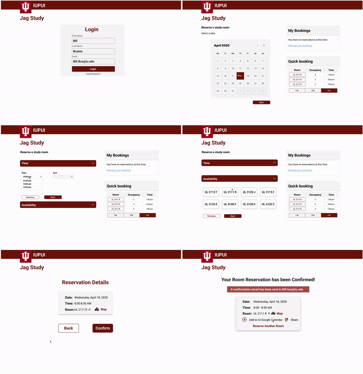
After visualizing the low-fi wireframes, We decided to make high-fidelity prototypes to test our solution on the students. Below are the high fidelity prototypes:
Testing
Hi-Fidelity Prototype Testing
Gathering user feedback
With the high-fidelity wireframes finalized, I crafted a prototype for user testing. We tested six students on the following flows:
Reserve a room
Reserve a room using the quick booking feature
Edit a room you booked.
Prioritizing feedback
Based on the feedback we received, we picked the main issues that were most prominent in the feedback given to us by our student participants.
Zero Fail-safe
Zero Fail-safe
They needed a fail-safe to return to if they made a mistake.
My booking
My booking
They were frustrated about being unable to take an extra step to view their booking.
SUS Score of 74.0
SUS Score of 74.0
Based the interaction with students we performed a system usability scale, we got a score of 74.0.
Final Prototype
Introducing JagStudy
Click below to test it out yourself!
Iteration
PRIORITY REVISIONS
How we adapted to user feedback:
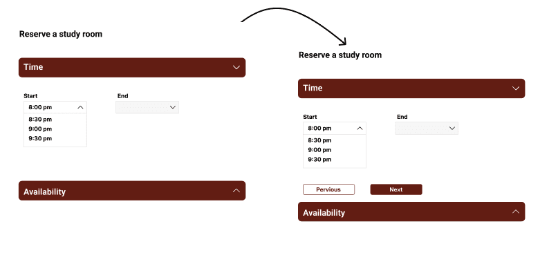
Zero fail-Safe:
Buttons were introduced to ensure students can return if they change something in their reservation.
Zero fail-Safe:
Buttons were introduced to ensure students can return if they change something in their reservation.

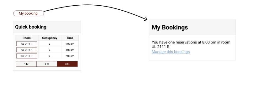
My booking:
My booking was made more useful by allowing students to see their booking when they log in and edit it.
My booking:
My booking was made more useful by allowing students to see their booking when they log in and edit it.

Impact
After a few months, the site launched in 2021 to the 29k students of IUPUI
After we handed off our research and the final design of Jagstudy, the project entered the development phase. Many elements of our research and design were incorporated into the final system used today by students at IUPUI.
After we handed off our research and the final design of Jagstudy, the project entered the development phase. Many elements of our research and design were incorporated into the final system used today by students at IUPUI.
The site launched in 2021 🥳 here is the link to the site if you are an IUPUI Alumni: Study Room Reservations (iupui.edu)
The site launched in 2021 🥳 here is the link to the site if you are an IUPUI Alumni: Study Room Reservations (iupui.edu)
All participants in the final prototype usability test agreed that it is easy to fix the error by adding the next and previous buttons.
Most participants mentioned that adding "new my bookings information" made getting quick information faster and easily accessible.
The final prototype scored a system usability Scale of 82.1 score with the students who tested out the final design.
Final Prototype
Introducing JagStudy
Click below to test it out yourself!
“ I really like this design that you all worked on and I don't think that I will be fighting the developer as much as you followed the guidelines I set. I'll be considering your teams research and overall project for the future redesign of the IUPUI Library reservation system.”
Gary R. Maixner III
User Experience Librarian and Liaison to Communication Studies at IUPUI Library
Reflections
This was the first project in which I led a group of designers. I realized that leading a group can be slightly different from being led. I managed tasks we had for the project and kept Gary updated on any deliverables we had. It was an exciting process, and I learned much about becoming a good leader from this project.
Next Steps
We explored how we could improve the reservation website, but I would love to explore how we can help navigate to the reservation room, as it was something that the students mentioned. Later in the future, we may venture into VR or AR to enhance that experience.
Here are some of my other case studies
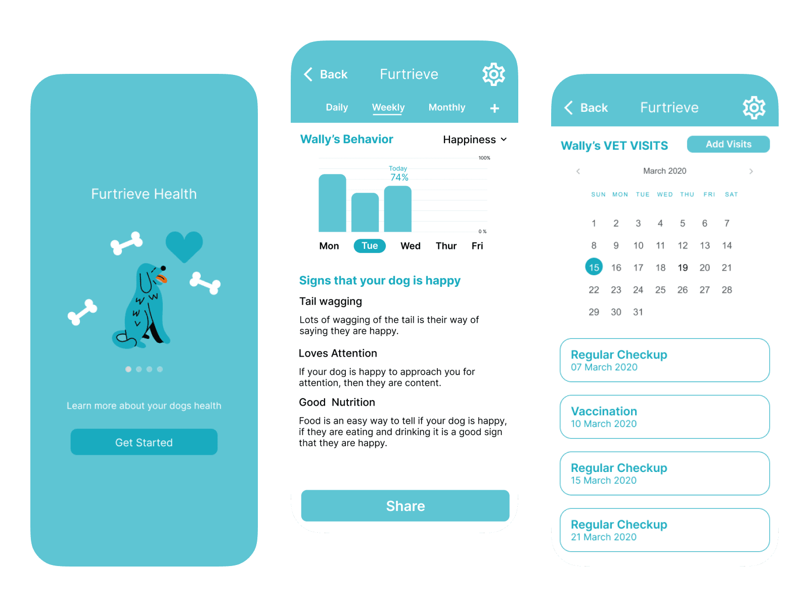
Furtrieve Health App
Created an AI driven health portal that helps track your dog's health.
Furtrieve Health App
Created an AI driven health portal that helps track your dog's health.
Furtrieve Health App
Created an AI driven health portal that helps track your dog's health.
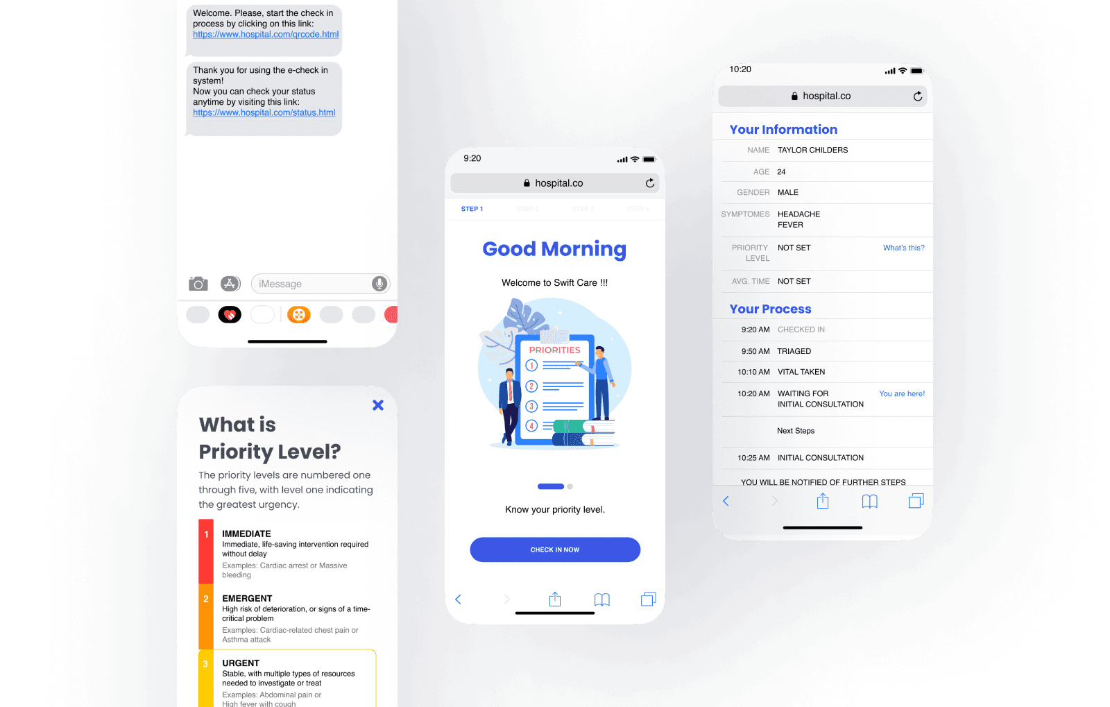
Swift Care
Created a mobile portal to help raise awareness of priority levels within urgent care.
Swift Care
Created a mobile portal to help raise awareness of priority levels within urgent care.
Swift Care
Created a mobile portal to help raise awareness of priority levels within urgent care.
